Last updated on December 20th, 2024 at 03:21 pm
Discover how web design can improve user experience and SEO for businesses. From responsive design to page load speed, learn the key elements to optimize.

Image by Gerd Altmann from Pixabay
This post may contain affiliate links. We may earn a commission if you purchase an item through our links. It costs you nothing and helps us to fund this blog. Please see our Affiliate Disclosure & Notification for details.
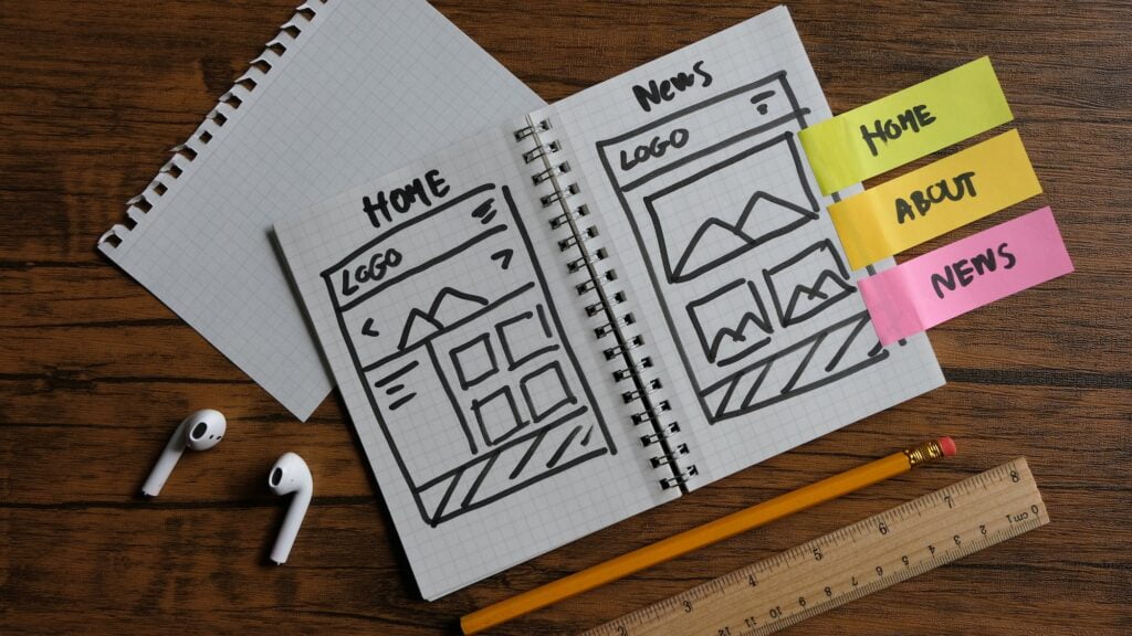
It’s been a while since I’ve written about web design, and today I’m gonna talk about how it can enhance user experience and SEO for businesses.
Web design plays a huge role in any business, and it’s important to understand the implications of getting it right. Design isn’t just about making something look nice – it’s about engaging your customers and creating an experience that they’ll remember and come back to. When done well, web design can also help boost your SEO, making it easier for potential customers to find you. In this article, I’ll explain how web design can help make your business stand out and draw in more customers.
How Web Design Impacts SEO
When it comes to web design and SEO, responsive design, structure and organization, and page load speed are all key elements. Having a website that’s designed to be optimized for all devices helps ensure that search engines can crawl and index your site properly. Additionally, having a well organized and structured site helps search engine bots understand what your content is about. Lastly, page load speed is critical to ensuring a great user experience, which helps with SEO.
Once you go through this article, you’ll be able to determine if you want to do this on your own or hire a professional. While CGS Web Designs focuses primarily on US-based residents, we recommend Glide Marketing who provide excellent SEO in Chelmsford for our UK readers.
Responsive Design
Now that we’ve discussed the basics of SEO, it’s time to talk about how web design impacts it. Specifically, let’s look at how responsive design plays a role.
Responsive design is the practice of creating a website that looks great on any device, regardless of size or type. This means your website will adapt to fit any device, from a laptop to a tablet to a phone. This is critical when it comes to SEO, because if your website isn’t optimized for the device it’s being viewed on, you’re not going to rank as well as you could.
Google takes website design into account when ranking pages, so if your website isn’t designed with mobile in mind, you’re going to fall behind. It’s been proven that users are more likely to leave a website if it’s not optimized for their device, and if visitors aren’t staying on your page, your SEO rankings will suffer.
Having a website that’s optimized for mobile devices ensures that all users will have a great experience, regardless of the device they’re using. Responsive design also helps you rank higher in the search engine results pages, so it’s worth taking the time to make sure your website is optimized for all devices.
Structure and Organization
Moving from the previous section, structure and organization is an important part of web design that also affects SEO. It’s important to ensure that your website is intuitive and easy to navigate, as this will make it easier for people to find the information they’re looking for. A well-structured website will also help search engines to crawl your pages more effectively.
When structuring and organizing your website, you should think about the user experience. Your website should be organized in a way that allows visitors to find the information they need quickly and easily. Try to use clear and descriptive page titles and headings, as this will make it easier for people and search engines to understand the content on your page. Additionally, it’s important to use breadcrumbs to help visitors navigate between pages and understand where they are on your site.
Another important part of website structure and organization is the organization of content on each page. Try to use logical headings and subheadings to break up your content into manageable chunks, as this makes it easier for visitors and search engines to understand what’s being discussed. Additionally, use clear and descriptive link text to help visitors understand where they will be taken when they click on a link.
In summary, structure and organization are important aspects of web design that can impact your SEO. By organizing your website and content in a logical way, you can make it easier for both people and search engines to find and understand your content.
Page Load Speed
So now that we know how important responsive design and structure and organization are for SEO, let’s take a look at page load speed. Page load speed is the amount of time it takes for a website to load and display its content, and it plays a huge part in how Google and other search engines rank websites. It’s also an incredibly important factor for user experience, as no one’s gonna stay on a site that takes forever to load.
When it comes to page load speed, you want to aim for a load time of under two seconds. This means that all the content on your website should be able to display within two seconds of someone accessing it. If your website is taking longer than two seconds to load, you’re gonna have some unhappy visitors.
Luckily, there are a lot of things you can do to improve your page load speed. For starters, you can compress your images and videos to reduce their size, which will help your page load faster. You can also reduce the number of plugins you’re using, as too many can slow down your site. Additionally, you can use a content delivery network (CDN) to store your website’s content on servers across the globe to ensure your visitors are receiving your content quickly.
At the end of the day, improving your page load speed is an essential part of good web design. Not only does it give your visitors a better experience, it also helps with your SEO rankings. So take the time to optimize your page load speed, and you’ll be sure to see the benefits.
Creating an Intuitive User Interface
Creating an intuitive user interface is all about making it easy for users to find what they need. To do this, it’s important to ensure easy navigation, a clear call to action, and consistent design elements. That way, users can quickly and easily find what they need without getting frustrated.
Easy Navigation
The ability to easily navigate a website is essential for your users to find the information they are looking for and to take action on your site. Creating an intuitive user interface with easy navigation is key to making the website experience enjoyable and successful.
Easy navigation means that it takes very little effort to get from one page to the other in a consistent, logical way. Not only should users be able to find what they are looking for easily, but they should also be able to do it quickly. If a user is having difficulty finding what they want, they will likely leave and go elsewhere.
A key part of easy navigation is making sure the menus are well-organized and clearly labeled. All links should be visible and easy to find. Make sure the menus are consistent across all pages, and that they are obvious and user-friendly. Additionally, don’t forget to include a search bar for users who know exactly what they are looking for.
Finally, don’t forget to include a breadcrumb trail that will allow users to easily retrace their steps if they have gone to a page too deep in the navigation. This will greatly reduce the frustration of having to re-navigate the entire website to get back to where they were. By implementing these navigation strategies, you can ensure that your website is easy and enjoyable to navigate.
Clear Call to Action
Now that we’ve discussed how web design impacts SEO and creating an intuitive user interface, let’s dive deeper into one of the key components of a successful website: the clear call to action. A clear call to action is a phrase or sentence that prompts visitors to take a specific action. It’s one of the most important elements of a website, as it’s what drives visitors to take a desired action.
When crafting a clear call to action, there are a few key points to keep in mind. First, it’s important to make sure the call to action is prominently displayed on the page. This means it should stand out from the other content on the page. It should also be easy to find and understand. It should be written in a way that’s concise and articulate, and should focus on the benefits of taking the desired action.
Additionally, it’s important to make sure there aren’t too many calls to action on the page, as this can be overwhelming and confusing. It should also be clear what action visitors are expected to take. For example, if you’re asking visitors to download a white paper, make sure it’s obvious that they need to click a link or a button to do so.
Finally, it’s important to test the call to action to make sure it’s effective. This can be done by running an A/B test, which will allow you to compare different versions of the call to action and see which one is more successful.
By following these tips, you’ll be able to create a clear call to action that will help drive visitors to take the desired action.
Consistent Design Elements
Now that we’ve discussed the importance of having easy navigation and a clear call to action on your website, let’s take a look at how consistent design elements can help to create an intuitive user interface.
Consistent design elements can be incredibly helpful in creating a user experience that flows easily and naturally. By using consistent design elements, such as font style, size, color, and grid layout, users can move easily from one part of your website to another without feeling confused or overwhelmed. Additionally, consistent design elements can help create a sense of trust and professionalism, giving visitors the impression that your website is reliable and well-built.
Not only do consistent design elements help to create an intuitive user experience, but they also help to reinforce your brand and its messaging. For example, if you’re a fashion brand, a consistent font style, size, and color creates a cohesive aesthetic that speaks to the brand’s identity and helps to create a memorable experience for visitors. Furthermore, consistent design elements can help to differentiate your website from competitors.
Finally, consistent design elements provide helpful visual cues that can guide visitors to the areas of the website they need. For example, elements such as arrows, lines, and colors can be used to draw a visitor’s attention to the most important areas of the website or direct them to the next step in their journey.
Ultimately, consistent design elements are an integral part of creating an intuitive user experience that visitors will appreciate and remember. By using these elements to reinforce your brand identity and provide helpful visual cues, you can create a user experience that will keep visitors coming back for more.
Improving Website Usability
To improve website usability, let’s start by talking about accessibility. Ensuring users of all abilities can easily access and use the website is essential. Moving on, let’s look at mobile-friendliness. Making sure the website is responsive and looks great on all devices is key. Finally, user testing is the best way to get feedback and make sure the website is as user-friendly as possible.
Accessibility
Now that we’ve improved the user interface to make it more intuitive, it’s time to focus on improving website usability. One of the most important aspects of usability is accessibility. Accessibility refers to how easily people of all abilities and disabilities can access a website and use its features.
Making a website more accessible can involve a lot of small tweaks, but it’s worth the effort. Adding alt-text tags to images can help visually impaired visitors understand what’s on the page. Adding subtitles or transcripts to videos can make them more accessible to people with hearing impairments. Making sure your website is keyboard-friendly can help people with physical disabilities navigate your site.
Of course, accessibility is about more than just adding features; you also need to go the extra mile to make sure existing features are accessible. For example, if your website includes an interactive form, it should be coded using HTML5 and ARIA attributes to make sure it’s accessible to screen readers. You should also check your website with tools like WAVE to make sure you haven’t missed anything.
Making sure your website is accessible is an important part of improving usability. It helps make sure everyone can use your website, regardless of their disabilities or abilities.
Mobile-Friendliness
Now that we’ve discussed creating an intuitive user interface, let’s talk about how to make sure that user interface is accessible and usable for everyone. One very important factor in this is making sure that the website is mobile-friendly. Mobile-friendliness is a requirement for any website today, so it’s essential to make sure your website is optimized for a wide range of mobile devices.
The first step is to ensure that the website is responsive. This means that the website will automatically adjust to fit different device sizes, from small mobile screens to larger tablet devices. This also means that the user experience should remain intact across all devices, which makes it easier for users to navigate and use the site regardless of the device they’re using.
Another important aspect of mobile-friendliness is making sure all the content is accessible on mobile devices. This means that all text, images, and other interactive elements should be visible and easy to use. Content should also be optimized for mobile, meaning that it should be easy to read and navigate on a smaller screen.
Finally, it’s important to test the website on different devices to make sure the user experience is consistent across all devices. This will help you identify any potential issues and make sure the website is as user-friendly as possible on mobile devices. By taking the time to make sure your website is optimized for mobile, you can ensure that all users have a positive experience on your website.
User Testing
Having an intuitive user interface is important, but it’s also important to measure and verify the usability of a website. That’s where user testing comes in. User testing involves assessing a website’s design, functionality, and usability by getting real people to use it.
User testing can be done in several ways, depending on the project’s budget and timeline. For example, you can conduct user tests onsite or remotely, depending on the requirements. Onsite user testing typically involves setting up a room with computers or laptops, and running a series of tests with real users. Whereas, remote user testing involves sending out tasks to real people who are located in different parts of the world.
When it comes to user testing, it’s important to have the right questions in place to understand how users interact with the website. Additionally, it’s important to provide clear instructions to the users so that they can understand the tasks. Furthermore, you should also allow the users to provide their feedback, so that you can make improvements.
User testing is a great way to improve website usability. By understanding how people interact with the website, you can identify design flaws, user experience problems, and overall usability issues. This will allow you to make changes that will improve the user’s experience and, ultimately, the website’s success.
Optimizing Content Delivery
I’m all for optimizing content delivery, so when it comes to compressed images, minimizing code, and content caching, I’m all for it! It’s the best way to ensure that websites load quickly and efficiently. Plus, it’s just good practice overall.
Compressed Images
Now that we’ve discussed ways to improve website usability, let’s focus on optimizing content delivery. Compressed images are an essential part of doing this, as larger images can slow down page loading speeds. I’m sure no one wants to wait for a website to load forever, so let’s take a look at some strategies for compressing images.
One way to compress images is to reduce the image resolution. This will reduce the file size, but make sure you don’t reduce it so much that it becomes blurry or pixelated. When choosing the right resolution, it’s important to consider the size of the image you need for the display, as using a higher resolution than necessary will increase the file size.
Another way to compress images is to use different file formats. JPEG is the most commonly used format, as it can compress images while still retaining good image quality. PNG is another popular format, but it generally produces larger file sizes than JPEG. You can also use vector formats, such as SVG, which are great for logos and icons.
Finally, image optimization tools can help you reduce the file size of your images without sacrificing the quality. These tools are great for automatically compressing images, as you can just upload your images and let the tool handle the rest. Plus, you can adjust the level of compression for each image.
Compressed images are a great way to optimize content delivery on a website, and with the right tools and strategies, you can make sure your images are loading quickly without sacrificing image quality.
Minimizing Code
Now that we have a better understanding of how to improve website usability, let’s take a look at optimizing content delivery. When it comes to reducing page load times, minimizing code is key.
Including too much code means pages take longer to download, leading to a slower user experience. To speed things up, you want to minimize the amount of code used to display content. This means removing any unnecessary lines of code, including comments and white space.
You can also minify your code to reduce the file size. Minifying code involves taking out all the unnecessary characters and whitespace, making the code smaller and more efficient. By removing these elements, you can make your code easier to read and faster to load.
Finally, you can refactor your code to make it more efficient. Refactoring code means restructuring existing code to make it more effective and organized. This will make it easier to read and navigate, plus it can help reduce the amount of code you need to use.
By minimizing code, you can significantly reduce page load times, making for a smoother user experience.
Content Caching
Building on the usability improvements, it’s time to head to the back-end of the website and optimize content delivery. Content caching is the process of storing commonly used data like HTML, JavaScript, and images so the website can be delivered more quickly. Doing this helps keep page loading times at a minimum, so visitors don’t have to wait around for content to load.
When it comes to content caching, first you’ll want to set up a CDN, or content delivery network. This is a network of servers that deliver web content from different locations, so the content can be delivered faster. This way, when visitors access the website, the content they need is already cached and ready to go, instead of having to be fetched from the original server.
You can also cache the content that’s already on the page. This way, when visitors visit the page, they don’t have to wait for the content to be fetched from the server. This makes the page load faster and gives visitors a better user experience.
Finally, you can use caching plugins to store content that’s used on multiple pages. This way, when a visitor visits the page, the content is already cached and ready to go. This saves time and resources, and helps keep page loading times to a minimum.
By optimizing content delivery, you can ensure that visitors get the content they need quickly. This makes the website easier to use and more enjoyable for visitors, leading to more conversions and sales.
Utilizing Web Standards
When it comes to web standards, HTML5 and CSS3 are essential. They provide the foundation for creating accessible, semantic markup, which can then be validated and optimized for performance. With the right resources and understanding, utilizing web standards is a breeze.
HTML5 and CSS3
Now that we’ve discussed optimizing content delivery, let’s turn our attention to utilizing web standards. HTML5 and CSS3 offer a combination of features that make designing and building websites faster and easier than ever before.
HTML5 and CSS3 allow developers to quickly create websites with more expressive markup and styling capabilities than previous versions of HTML and CSS. With HTML5, developers have access to a range of new semantic tags. This means that developers don’t have to rely on tags to create the structure of a website. Instead, they can use tags that more accurately describe the content. Similarly, CSS3 provides developers with the ability to create beautiful and complex designs with features such as animations and transitions.
HTML5 and CSS3 also make it easier to create websites that are both cross-browser compatible and mobile-friendly. Cross-browser compatibility refers to the ability of a website to display and function properly on multiple browsers. And, with the widespread use of mobile devices, it’s more important than ever to make sure websites are optimized for these devices. HTML5 and CSS3 make it easier to create websites that are optimized for both mobile and desktop browsers.
All of these features make HTML5 and CSS3 invaluable tools for developers. With the help of HTML5 and CSS3, developers can create beautiful and functional websites that are optimized for both mobile and desktop browsers.
Semantic Markup
Now, let’s look at how semantic markup can help to improve user experience. Semantic markup is what helps browsers to understand the structure of the content and how it is laid out. It’s the key to making sure that websites are optimized for accessibility, so that all users can access the content regardless of their device or ability.
Semantic markup is also important for SEO purposes, as search engines are able to better understand the content on a page when it is marked up properly. This can help to boost search engine rankings, as well as make it easier for users to find the content they’re looking for.
One of the most common uses of semantic markup is to create microdata. This is a type of markup that allows search engines to better understand the content on a page, and can help to boost rankings. This type of markup can also be used to provide additional information to the user, such as ratings, reviews, and product information.
In conclusion, semantic markup is an important tool for optimizing content delivery. It can help to make websites more accessible, boost SEO rankings, and provide additional information to users. By using semantic markup, businesses can ensure that their content is optimized for search engine results, as well as ensuring that all users have access to the content they need.
Validated Code
Now that we have discussed the importance of web standards and the power of HTML5 and CSS3, let’s talk about validated code. Validated code is essential for creating great user experiences. It not only ensures that our webpages look and feel great, but it also ensures that our code is error-free.
Using validated code is a simple process that requires a few steps. First, you need to check your code against a validator to make sure that there are no errors. It is important to note that standard HTML and CSS validation is not enough. You also need to make sure that your markup is valid according to the W3C standards.
Once you have validated your code, it’s time to make sure it looks great. This means testing your layout on different browsers and devices to make sure it looks the same on all of them. You should also make sure that the code is optimized for speed and performance.
Finally, you should always keep your code up-to-date with the latest standards and updates. This will ensure that your website is running at its peak performance and that your users are getting the best experience possible. Validating your code is an important step in creating a great user experience, and it should be taken seriously.
Employing Accessibility Practices
When it comes to employing accessibility practices, ARIA markup, alt attributes and keyboard navigation are all important. ARIA markup helps ensure that assistive technologies can understand the structure of a web page. Alt attributes can help those using screen readers access an image’s content. Lastly, keyboard navigation allows users to easily tab through a website without a mouse.
Aria Markup
Now that web developers have an understanding of utilizing web standards, let’s look at how to further improve our website’s accessibility through employing accessibility practices. One of the most important practices is ARIA markup. ARIA stands for Accessible Rich Internet Applications and it helps make web content and web applications more accessible to people with disabilities.
Using ARIA requires understanding and use of HTML elements, attributes, and values, as well as DOM (Document Object Model) scripting. ARIA markup enables us to identify areas of the page that need to be more accessible to users, such as widgets, live regions, and regions of the document that are frequently updated.
When writing ARIA-enabled HTML, you must always provide valid HTML markups for all elements. This means that you need to use the correct element for the context, and you should use the correct roles and states. You should also provide labels and descriptions for elements so that users can understand them.
To sum up, ARIA markup is a great tool for web developers to make their websites more accessible, and it’s important to understand the basics of HTML, attributes, and values when implementing it. With a little bit of practice, you can easily make your websites more accessible to everyone.
Alt Attributes
Now that we’ve got our web page up and running with the help of web standards, let’s dive into the world of accessibility. One of the most important aspects of accessibility is using alt attributes. Alt attributes are used to provide a text description of an image, and they can be used for users who may have difficulty seeing or understanding the image.
Using alt attributes is a great way to make sure that everyone can understand and enjoy the content on your page. Plus, it helps with SEO too, so it’s a win-win! When writing alt attributes, make sure to keep it concise and descriptive. You don’t want to overwhelm the reader with too much information, but you do want to make sure that the description is accurate.
Not only is it important to include alt attributes on your images, but also on your buttons and other interactive elements. This is especially true for buttons that don’t have a visible label. This will help to ensure that all users, whether they are using a screen reader or not, will be able to understand and interact with the content on your page.
Alt attributes are just one of the many tools you can use to make your website more accessible, but they are an important one. By spending a few minutes adding in alt attributes, you can help to create a better user experience for everyone.
Keyboard Navigation
Making the shift from web standards to accessibility practices is essential for creating an inclusive user experience. Keyboard navigation is a critical aspect of accessibility that can be implemented to ensure users with disabilities can navigate a website or application without the use of a mouse.
When it comes to keyboard navigation, the focus should be on creating a logical and intuitive tab order. This refers to the order in which a user will tab through the various elements on a page. It should be designed in such a way that it feels natural and makes sense for the user, even if they don’t know the website.
Designers and developers should also pay attention to the visual cues of focus. When a user tabs through a page, they should be able to tell which element has focus. A classic example of this is a dotted outline or subtle border around the focused element. This way, the user knows where they are and where they’re going.
Finally, it’s important to remember that not all keyboard navigation is the same. Different operating systems and web browsers will often handle this type of navigation differently, so it’s important to test across different platforms to make sure the experience is consistent. By taking the time to get this right, you can ensure that all users, regardless of their abilities, can navigate your website or application with ease.
Incorporating Schema Markup
When it comes to incorporating schema markup, it’s important to consider structured data, rich snippets, and SEO. Structured data helps search engines better understand the content of a website, while rich snippets give search engines a preview of what the page is about, which can help boost its ranking. Finally, SEO can be improved by using schema markup to optimize content for search engine algorithms.
Structured Data
Moving on from accessibility, let’s talk about structured data and how it can help your website. Structured data is a way to provide information to search engines about what’s on your website, and it can help your website show up in search results. It’s a great way to make sure your website is optimized for search engines and can help you reach more customers.
Using structured data, you can provide search engines with information about the contents of your page, like types of products or services, reviews, authors, and more. This helps search engines understand the content on your page and can result in your page showing up in more relevant search results.
Another benefit of structured data is that it can help create rich snippets. Rich snippets are pieces of information that show up in search results next to a website, like ratings, reviews, and product details. Rich snippets are more eye-catching than regular search results, which can help your website stand out and get more clicks.
Finally, using structured data can help improve the overall search engine optimization (SEO) of your website. Because structured data provides information about the contents of a page, search engines can crawl through the data and easily understand what a page is about. This helps ensure that you show up in more relevant search results, which can lead to more website visitors.
Rich Snippets
Now that we know how to incorporate accessibility practices into our website, let’s talk about how to take it further with rich snippets. Rich snippets are a code that is added to a website’s HTML which allows search engines to better understand the content of a webpage. This helps search engines show a better summary of the page in their search engine result pages.
Rich snippets can be used to show additional information, such as a review, price, author, or product details. This helps draw attention to the search result and can even improve click-through rates. It can also help search engines understand the content better and improve the ranking of the website.
Rich snippets involve adding structured data to a website, which can be done in a variety of ways. There are many tools out there that make it easier to add structured data to a website, such as Google’s Structured Data Markup Helper. This tool can help you generate the code for the rich snippets and add them to your website.
Overall, rich snippets can be a great way to get more attention for your website in search engine result pages. Not only can it help improve click-through rates, but it can also help search engines better understand the content of your page and improve your rankings.
Search Engine Optimization
Now that we’ve discussed the importance of making your website accessible to all users, let’s talk about how to optimize it for search engines. Search engine optimization (SEO) is all about making sure your site is visible to search engines like Google, so you can get more organic traffic.
There are a number of steps you can take to improve your SEO, including incorporating schema markup and using rich snippets. Schema markup is code that you add to your website to give search engines more information about your content. Rich snippets are the extra bits of information that appear in search engine results, like star ratings and product images.
But SEO isn’t just about adding code and images. It’s also about giving search engines the right content to display in their results. That means you need to make sure your website has good, relevant content that people are actually looking for. This means using the right keywords in your title tags, headings, and content. It also means making sure your content is unique and useful to readers.
By following these steps, you can make sure your website is optimized for search engines and reaching the right audience.
Integrating Social Media Buttons
By integrating social media buttons onto your website, you can increase visibility and boost engagement with your content. Plus, it can help enhance your reputation by showing users that you’re active on social media.
Increase Visibility
Now that your business is equipped with Schema Markup, you can further boost its visibility online. Integrating Social Media Buttons is a great way to do this. It’s a relatively simple and effective way to get your business out there and make sure it’s seen.
Using Social Media Buttons allows you to create a direct link between your website and your social media profiles. This helps to increase your business’ visibility on social media platforms, as users who visit your website can take advantage of the easy-access buttons and share it with their friends and followers. This ensures more people will be exposed to your website, as well as your business as a whole.
In addition, having these buttons prominently displayed on your website will help to increase your brand recognition. It gives visitors a clear indication of your presence on social media, and encourages them to follow your profiles and engage with your content. Plus, when users share your website, it will direct their friends to the same page – and with the buttons in place, they can easily follow your social media profiles too!
Finally, it’s also worth noting that having Social Media Buttons integrated into your website will make it look more professional and trustworthy. It shows that you are active and engaged with your digital presence, which enhances your reputation and encourages visitors to stay on your website. This all adds to the overall success of your business, and is a great way to increase visibility online.
Boost Engagement
Now that you’ve got the foundation of schema markup in place, it’s time to take things up a notch and find ways to boost engagement on your website. Integrating social media buttons into your website gives your visitors a way to share your content and spread the word about your business in just a few clicks. This can help you reach more people, drive more traffic and ultimately, increase conversions.
Adding social media buttons to your website is easy and straightforward. All you have to do is find the right plugin, add the buttons to your site and make sure they are properly linked to your social media profiles. For starters, you can add buttons for the most popular social networks, such as Facebook, Twitter, Instagram and LinkedIn. If you want to take things a step further, you can also add buttons for niche social networks like Reddit, Pinterest and YouTube.
Moreover, you can also use social media buttons to personalize your website for different user segments. For example, if you have a blog focused on technology, you can add social share buttons specifically related to tech-related networks, such as Hacker News or Stack Overflow. This will make it easier for the right people to find and share your content, and it will also give your website a more tailored look and feel.
Finally, social media buttons can also help you build your brand reputation. When your visitors share your content, it will get seen by more people, and this will help you establish yourself as an authority in your niche. All in all, adding social media buttons to your website is an effective way to boost engagement and increase the visibility of your brand.
Enhance Reputation
Now that you have incorporated schema markup and optimized your website to increase visibility, it’s time to take the next step to further enhance your website’s reputation – integrating social media buttons. Social media buttons are a great way to boost engagement on your website and gain a wider audience.
Adding social media buttons to your website is not only beneficial to your reputation, but it also helps you to be more visible in the social media world, and shows your audience that you are active and involved in the ever-growing online community. If you are active on social media, it shows that you are up-to-date with the latest trends and that you are willing to stay connected with your audience.
It is important to be selective about which social media buttons you choose to integrate into your website, as there are so many platforms to choose from. You want to make sure that you are not bombarding your audience with too many options, so it is best to pick the social media platforms that are most relevant to your business. Try to stick to just two or three social media platforms, otherwise your website may look cluttered and unprofessional.
By integrating social media buttons into your website, you can make it easier for your audience to find you online and connect with you. This can help to build trust and credibility, and can ultimately help you to enhance your reputation. It also gives your audience the opportunity to share your content, which can reach a much wider audience and increase brand awareness.
Final Thoughts
Web design is a key element in creating a great user experience while also boosting SEO. A good web design can make the difference between a successful website and a website that’s left behind. By creating an intuitive user interface, improving website usability, optimizing content delivery, utilizing web standards, employing accessibility practices, incorporating schema markup and integrating social media buttons, web design can help improve SEO while providing users with a great experience.
Sharif Jameel is a business owner, IT professional, runner, & musician. His professional certifications include CASP, Sec+, Net+, MCSA, & ITIL and others. He’s also the guitar player for the Baltimore-based cover bands, Liquifaction and Minority Report.
Subscribe to Our Mailing List
If you found the information in this post helpful, we'd love to have you join our mailing list. We promise we won't spam you, we only send out emails once a month or less.